Luma provides a wide range of customization options for completely customizing the look and feel of the web widget. To do so:
...
Web Widget Location
You can change the location of the web widget icon on a web page by editing the following fields:
- Position
- Bottom
- Right
- Height
- Width
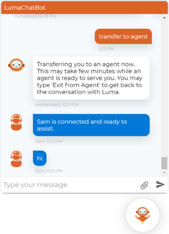
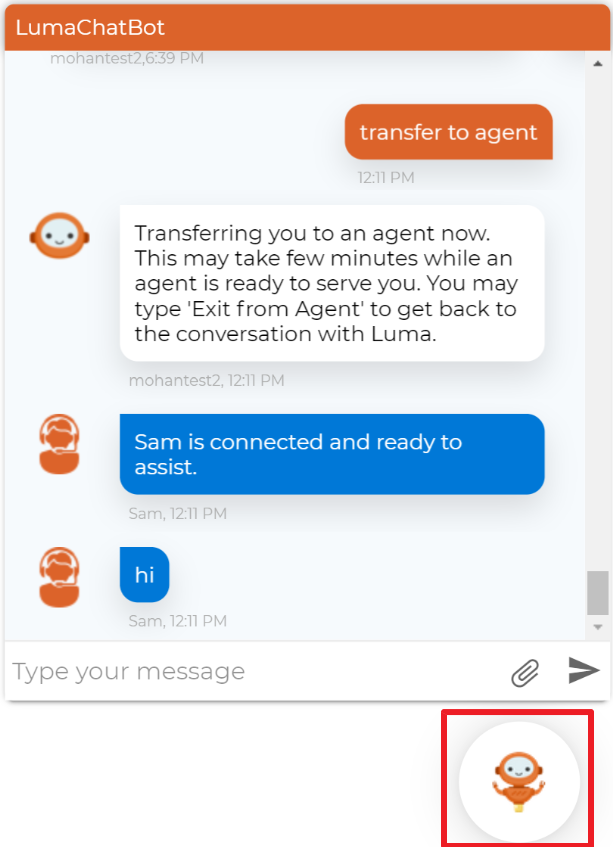
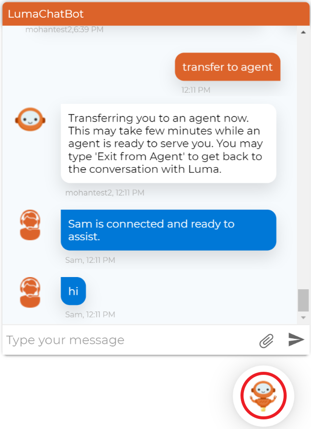
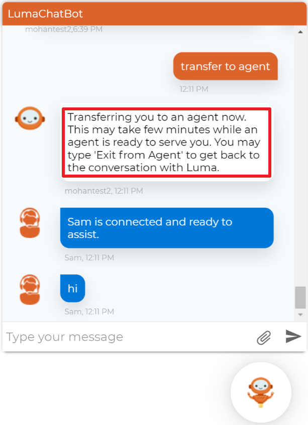
Header Container
To edit the Header Container (to change the background color of web widget header as shown in the following sample image), update the following styles:
- Background
- Padding
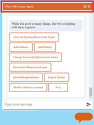
Chat Item User
To edit the Chat Item User (the background color of the user responses as shown in the following sample image), update the following style:
- Background
Chat Item Bot
To change the Chat Item Bot, update the following style:
- Background color
Chat Container
To edit the Chat Container (it is the background color of the container as shown in the following image), update the following styles:
- Position
- Right
- Bottom
- Width
- Height
- Max width
- Max height
- Box shadow
- Border radius
- z -index
Chat Text
To edit the Chat Text, update the following styles:
- White space
- Max width
Text Color
...
- Color
...
Luma provides a wide range of options for completely customizing the look and feel of the web widget. To do so:
- Open the Luma folder from the luma-web-chat-widget folder and then edit the luma-web-widget.css page, which appears as shown below.
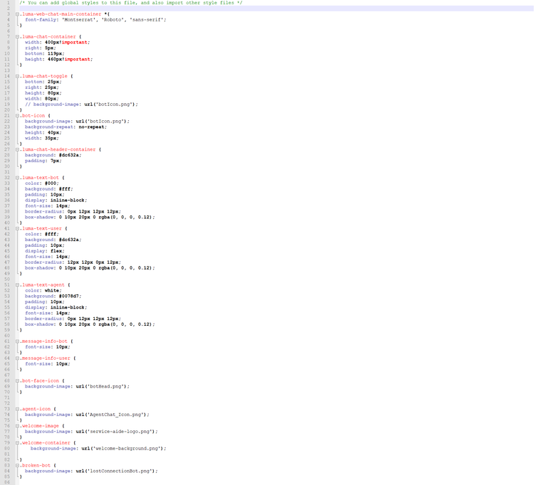
- The default font provided in the CSS stylesheet is Montserrat, however, you can use any font as required.
- To change the web widget image, provide the image URL in the background image.
Luma Chat Container
You can customize the chat container using the following options:
- Width
- Right
- Bottom
- Height
Luma Chat Toggle
You can change the chat toggle icon and position by editing the following styles:
- Bottom
- Right
- Height
- Width
- Background image
Bot Icon
You can change the bot icon and edit the following styles:
- Background image
- Background repeat
- Height
- Width
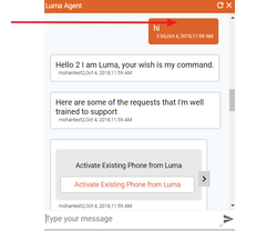
Luma Chat Header Container
To edit the Header Container (to change the background color of web widget header as shown in the following sample image), update the following styles:
- Background
- Padding
Luma Text Bot
You can change the appearance of the bot text by editing the following styles:
- Color
- Background
- Padding
- Display
- Font size
- Border radius
- Box shadow
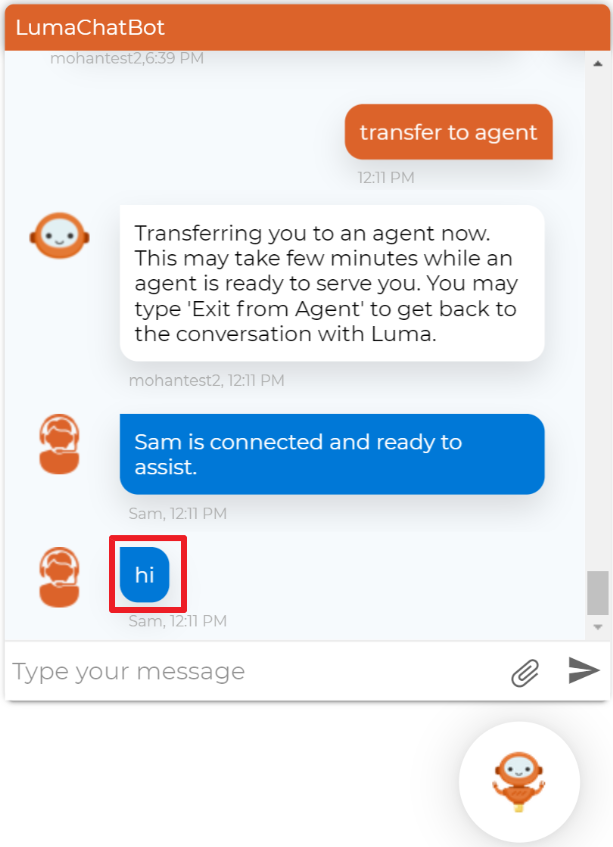
Luma Text User
You can change the appearance of the user entered text by editing the following styles:
- Color
- Background
- Padding
- Display
- Font size
- Border radius
- Box shadow

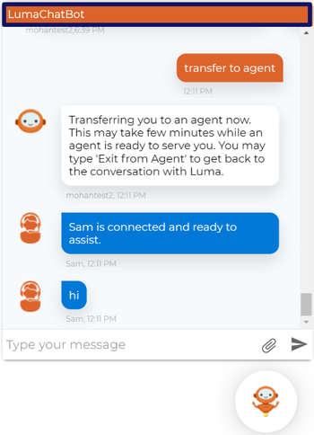
Luma Text Agent
You can change the appearance of the agent entered text by editing the following styles:
- Color
- Background
- Padding
- Display
- Font size
- Border radius
- Box shadow
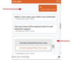
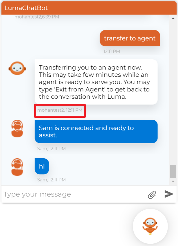
Message Info Bot
To edit the message information of the bot (which includes the bot name and the message displayed timestamp to the user), change the font size.
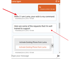
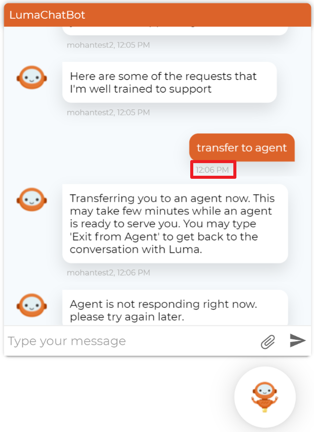
Message Info User
To edit the message information of the user (which includes the user name and the message displayed timestamp to the user), change the font size.
Bot Face Icon
To change the bot face icon, provide the image URL in the background image.

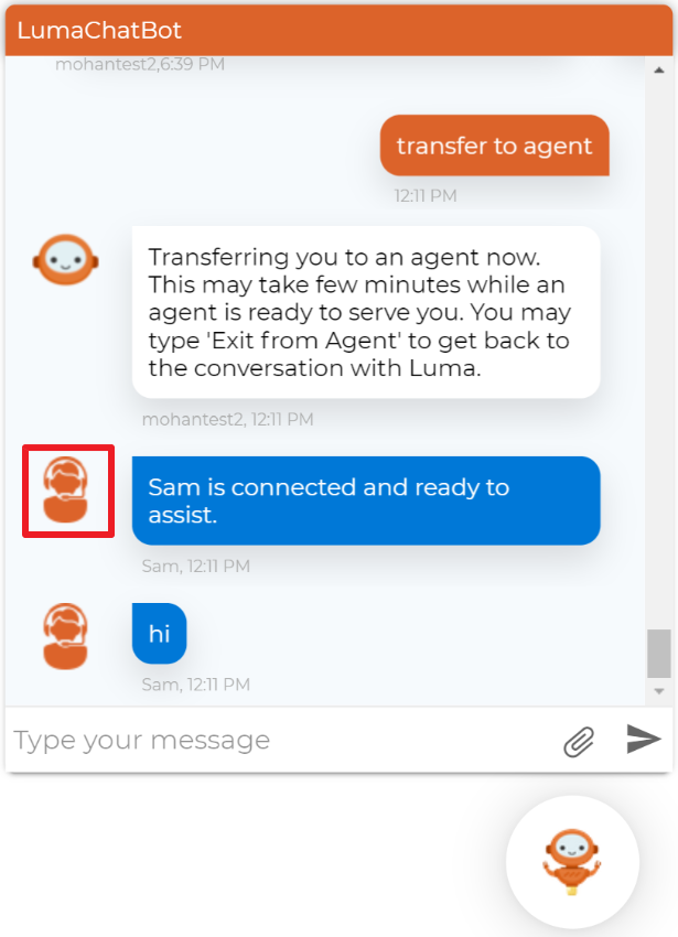
Agent Icon
To change the agent icon, provide the image URL in the background image.
Welcome Image
To change the welcome image, provide the image URL in the background image.

Welcome Container
To edit the Welcome Container (it is the background color of the welcome container as shown in the following image), update the image URL in the background image.