Reporting
- UdayKiran.Guduri (Unlicensed)
- priti.hota (Deactivated)
Intelligent Service Management offers two types of main reporting capabilities, General and Advanced, which are accessed from the Reports, SERVICE DESK main navigation panel.
General Reports
General Reports are documented here. 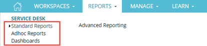
- Standard Reports offer 76 pre-defined reports with filters that you can set before running, or schedule to run. The reports and the layouts cannot be modified.
- Adhoc Reports offer 59 pre-defined reports that can be run, schedule or exported. You can create new reports in this space but you cannot modify the layout of the report.
- Dashboards offer limited features compared to the Dashboards for Advanced Reports which replaced them. They are available in the system in order to support customers who created general dashboards before the advanced ones were available.
Advanced Reports
Advanced Reports provide comprehensive and interactive reporting and data analysis capabilities to Intelligent Service Management. It is built using Jaspersoft Reports and offer more flexibility in designing and formatting reports than the general options. Read about Advanced Reporting here.
Examples of tasks you can perform with advanced reporting include:
- Create new reports that are based on views that are designed in a web-based, drag and drop Ad Hoc editor.
- Schedule reports for distribution through email and storage in a repository.
- Add several reports in a single and integrated view as Dashboards to display the business trends.
Intelligent Service Management provides 11 reports and 1 dashboard out of the box. These reports cannot be modified or inactivated, but they can be run and scheduled. The steps to take before creating new reports include:
- Synchronize custom attributes with the domain so they can be reported on
- Create an ad hoc view with the fields to show in the report
- Save the ad hoc view as a report
- Format the look and feel of the report
- Assign permissions to users to manage, view and create reports. See here for instructions on assigning permissions.
Review Advanced Reports
From the Home tab you can:
- Run and schedule reports
- Create, edit and delete an Ad Hoc view
- View, schedule and delete reports created from your Ad Hoc Views
- Create a Dashboard from existing reports and delete a non-CA Dashboard
Actions Button
The Actions button on the Advanced Reports overview tab provides access to:
- Edit Domain
- Create Ad Hoc View
- Create Dashboard
- Synchronize your Custom Fields
Assign Reporting Permissions
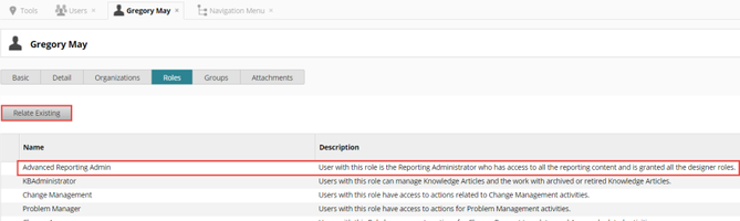
In order for analysts to have permissions to view, create or manage reports, they must have the correct reporting roles applied to their contact record. In this example, Greg is a manager with a floater license to Intelligent Service Management and requires access to create ad hoc views and reports.
Greg must be able to access the Report module. Permissions for modules are managed in the Navigation Menu. The documentation wiki, under Assign Permissions here, provides instructions on accessing the Navigation Pane. The REPORTS navigation menu group has the Administration group and five reporting roles automatically assigned to it, as seen below.
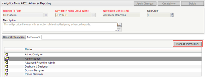
If our analyst Greg has either the Administration group, or any of the roles associated with his contact record he will inherit permissions to view the Advanced Reporting navigation menu. The easiest thing to do would be to add Greg to a group or role that has permissions to the navigation pane, but we can also select the Manage Permissions button and add him individually.
Greg will need the Advanced Reporting Admin role assigned to his user record in order to access all the content in Advanced Reporting. To do this update the Roles tab on his contact record by selecting Relate Existing.
Run an out-of-the box report
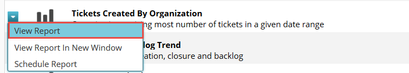
To test security, we will log into Intelligent Service Management as Greg and access the Advanced Reporting.
- Navigate to REPORTS> SERVICE DESK> Advanced Reporting
- Select View Report for Tickets Created By Organization
- Hovering over a piece of the pie will show additional details for that slice
- Selecting the Chart Types icon will allow you to change the look of the chart
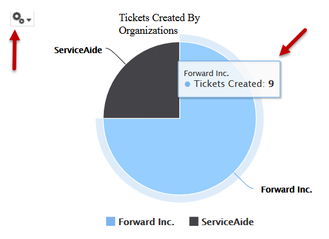
- From the report, you can modify the date filter, save the report, or export it into several different formats.
- Close the Report window
Synchronize your Custom Attributes
In order to report on any custom attributes that you have added to your tickets, such as the one we created in process workflow example above, we must synchronize them with the dataset. The data type will automatically be presented in the correct format, so there is no need to calculate fields to get the data to display properly.
Follow instructions 1-5 on the documentation wiki here to Sync Custom Fields to Domain. In our case, we are using the Cloud SM domain as this is the out of the box domain with no previous updates.
Example: Create a Simple Table Report
In this example we will create a new Ad Hoc view using the custom attribute from the process workflow example, and save it as a report.
- Navigate to REPORTS> SERVICE DESK>, Advanced Reporting
- Click Actions
- Choose Create Ad Hoc View
- From the Select Data window, select Cloud SM and Choose Data…
- In the Source column, select on Tickets and click on the
 icon to move it to the right side Selected Fields column.
 - Click on the Display option
- Under Source Name column, scroll down to Custom Attributes and click the arrow to expand it
- Rename the Display Label field from Select Database Server Type to DB Server Type by clicking on the field:
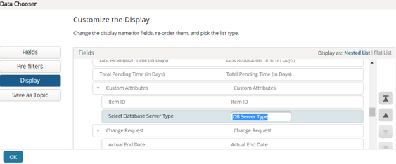
- Click OK
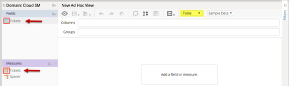
New Ad Hoc View
The New Ad Hoc View window should now be open with the chart type set to Table ![]() by default.
by default.
- Expand Tickets under both the Fields and Measures sections in the left pane to show the available fields.
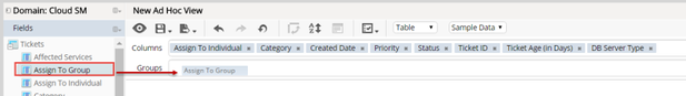
Fields in the domain are defined as a Measure or dimension field, which affects how data is represented in visualizations. Measures typically contain numeric data that can be aggregated in crosstab fashion. - Drag and Drop or double click on the following fields to move them to the Columns row.
You can also multi-select fields and drag them to the column or row location.- Assign to Individual
- Category
- Created Date
- Priority
- Status
- Ticket ID
- Ticket Age (in Days)
- Custom Attributes->DB Server Type
- Drag the Assign To Group to the Groups row.
- Change the order of the columns by dragging and dropping the fields in the Columns row at the top of the New Ad Hoc View window. Ex. drag Ticket ID to the first field in the Columns row.
- Change the width of a column by dragging the column lines right or left
- Right click on the Ticket Age (in Days) field and select Use for Sorting
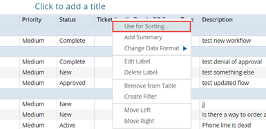
- Set the sort order to descending by clicking the field until the arrow is pointed downward for descending – largest to smallest
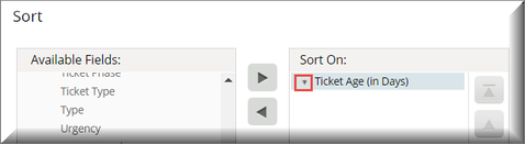
- Click OK in the Sort Box
Add A filter
Now we'll add a filter so that only tickets with no analysts assigned show up in the list.
- Right click on the Assign to Individual field from either in the report, on the Columns row field, or from the left side field under Fields.
The Filters tab will open. - In the far right filter pane, keep the default of "equals" with a value of [Null] and click Apply at the bottom of the Filter column
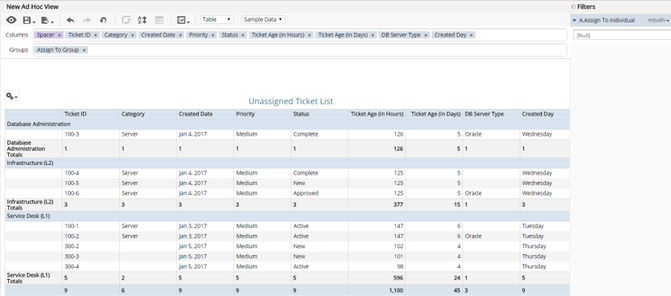
- Add a Title to your report by clicking on Click to add a title. For example: Unassigned Ticket List
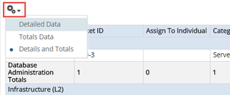
- Select the gear icon and select Details and Totals.
- Now that we've filtered on tickets with no assignee, we should remove the Assign To Individual field since it will always be empty. Right click on the field and select Remove from Table.
Creating a Calculated field in Ad Hoc View
Now we will create two new calculated fields to use in our report to show the busiest day of the week and ticket age in hours. These calculated fields are valid only for this Ad Hoc View.
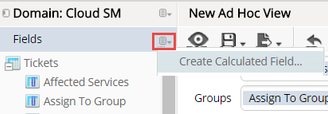
- In the left Fields column, select the Create Calculated Field icon

- Select Create Calculated Field…
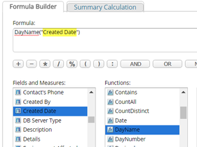
- Create calculated field: Created Day. In the formula Editor enter:
- Field Name: Created Day
- In Functions column scroll down and double click on DayName. This will move the function toe the formula area.
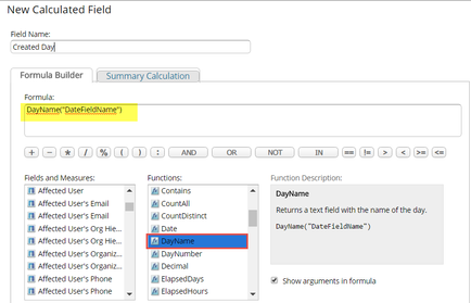
- Edit the formula field to replace DayName("DateFieldName") by highlighting "DateFieldName" in the formula field and double clicking on Created Date in column Fields and Measures.
- Click Validate button, a confirmation message should appear.
- Click Create Field, a yellow band appears on the top of the screen confirming your creation.
- Create calculated field:Ticket Age (in Hours). For Ticket Age (in hours), specify:
- Field Name: Ticket Age (in Hours)
- In the Fields and Measures column scroll down and double click on Ticket Age (in Days)
- Edit the formula field to read: "Ticket Age (in Days)" * 24
- Click Validate button, a confirmation message should appear.
- Click Create Field.
 . They can also be edited if the formula has to be modified.
 - Drag and drop fields to create the Ad Hoc View.
- Our Ad Hoc View will look like this:
Save the Report
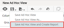
- Save your Ad Hoc View and create a report from the menu bar by selecting the save icon
- Select: Save Ad Hoc View and Create Report
You can save your view and report to a server folder where you and others with proper security access can see it. - Enter:
- Data View Name: Unassigned Ticket List
- Report Name: Unassigned Ticket Report
- Select the Shared folder under your slice folder and save to the adhoc and Reports folders
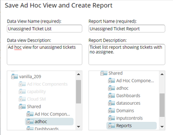
- Click Save
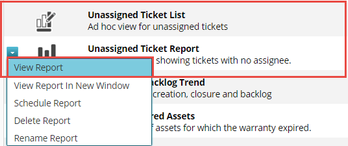
- Close the Ad Hoc Editor tab
- Refresh the Advanced Reporting Overview list. You should see your Ad Hoc View and the Report.
Format your report
Now that you have a report, you can format how it looks. Basic Formatting can be applied at 3 levels, on a column by column basis:
- Headings: set font, size, color… and also modify the column headings.
- Group by field: set font, size, color for group heading tables
- Detail Rows: set font, size, color at row level.
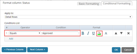
In this example we'll create conditional coloring for all tickets that have an Approved status. By selecting a column heading, you can modify content.
- Click on the drop down next to your report and select View Report
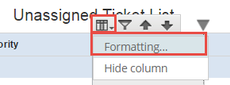
- Click on the Status column
You can see the available formatting options for this column, such as moving and hiding columns. - Click Formatting from the Column options icon
- Modify the column header to underline it with blue text
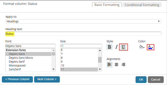
- Select the Conditional Formatting tab
In this use case we want Approved tickets displayed with a green background. - Click
 hyperlink under the Conditions List
 - Specify the condition as:
- Operator: Equals
- Condition: Approved
- Specify green background
- Click the OK button
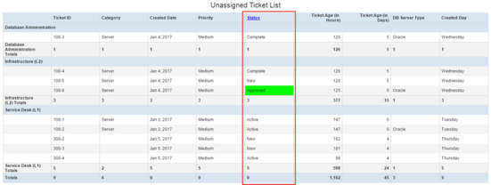
- Your report's Status column should now look like this:
Example: Create a Simple Crosstab and Chart Report
This example will demonstrate how easy it is to create a crosstab report.
- Navigate to REPORTS> SERVICE DESK> Advanced Reporting
- Click Actions
- Choose Create Ad Hoc View
- From the Select Data window, select Cloud SM and Choose Data…
- In the Source column, select on Tickets and click on the icon to move it to the right side Selected Fields column.
- Expand Tickets under both the Fields and Measures sections in the left pane to show the available fields.
- Select Crosstab from the report type dropdown
- Drag the Priority field to Columns
- Drag the Ticket Type field to Rows
- Drag the Ticket Count measure to Rows (tip: it's at the bottom)
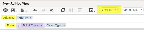
- Give your Ad Hoc View a name: Number of Tickets by Type
Your crosstab report should look similar to this: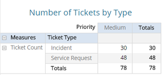
- Save your Ad Hoc View as you did before.
- Change the type of view from Crosstab to Chart
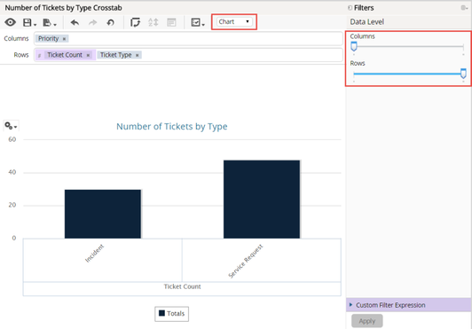
- The chart visualizer lets you zoom through various levels of data.
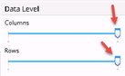
- Move the Data Levelbars back and forth to watch the report presentation change
- Select the gears icon
 and select Chart Format
- To change the rotation of the Ticket Type text, update the X Axis.
- Update the X Axis rotation to 0 to save room on the report
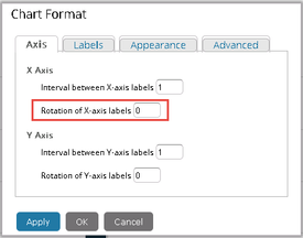
- Click Apply
- Click OK
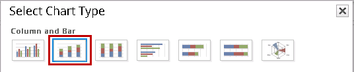
- Select the gear again and select Chart Types
- Update the X Axis rotation to 0 to save room on the report
- A pallet of available chart types is presented.
- Change the chart type to a Stacked Column
- Set both data level bars to the far right to see the most detailed data level
- Change the chart type to a Stacked Column
- Save and Close your Ad Hoc View
Related content
© 2019 Serviceaide 1-650-206-8988 http://www.serviceaide.com info@serviceaide.com